Sales, squeeze, splash, and landing pages. What’s the difference?
Today’s consumers are shrewd. They are more demanding than ever, and simply clicking on external advertisements is not enough to draw them into your site. This means that a landing page is something that your company needs.
The first thing your audience will notice and remember about your brand is your landing page. It’s the first impression you’re making, so it’s more important than you think.
Your landing pages are opportunities to engage your audience, and to accurately represent your brand’s reputation from the get go. A short, sweet, and uncluttered page will highlight key information while encouraging readers to click through to your other web pages. This blog post will share all you need to know to have a successful landing page in 5 easy steps with examples.
What is a landing page?
A landing page is a small step towards gaining traffic on your site. It’s the first page you land on after clicking a link or an ad.
A landing page could be anything: your home page, a contact page, or even a blog post.
In digital marketing and B2B PR, a landing page is a page on your site that is made to convert visitors into leads. It is a standalone page created for marketing and advertising campaigns, has a simple focus or goal, and doesn’t include other examples. It’s a campaign-specific page with one call to action.
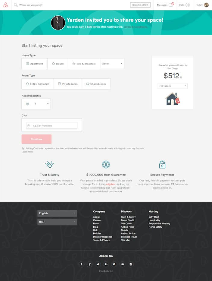
Check out Airbnb’s landing page:
Not only does Airbnb’s landing page appeal to customers with the desire for more money with its calculator, but the call to action (CTA) button is bright red on a dull background. When clicking on an Airbnb ad, this is the page you will land on.
How does a landing page work?
Now that you know what a landing page is, it’s time to understand how these pages actually work. The internet is cluttered with ads, but let’s say one stood out by its bold CTA, and you click on it. Now you’re on the site’s landing page.
Most landing pages like the one you landed on probably have a form. This form converts visitors to leads. Once you fill out the form on the landing page, the information you entered is stored in a leads database.
You can do the same for your own site. Once a visitor fills out the form on the landing page, you provide them with a piece of compelling content. You can use the information the visitor supplied in the form for future marketing efforts.
Types of landing pages
There are multiple types of landing pages that typically fall into three main categories:
- Splash pages
- Squeeze pages
- Sales pages
A marketing campaign could use one or multiple types of landing pages, depending on the CTA.
Splash pages
Splash pages are used when marketers want to send traffic to a specific piece of content. The goal is to pique the visitor’s interest enough so that they will click through to the website of the business. Splash pages usually have a clear call to action (CTA). In other words, the landing page is designed to get visitors to click to another page.
A splash page or a welcome page comes before any other page on your website. It’s like an introduction for your visitors. These pages welcome the visitor and act as standalone pages or full-screen pop-ups when someone lands on your website.
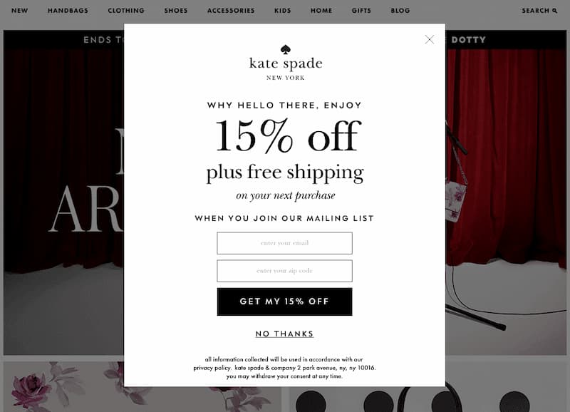
Check out Kate Spade’s common splash page pop-up.
Like a lot of retailers, Kate Spade chose a standard marketing method. Their pop-up gets the visitor a discount on their site, and in exchange, they get their email and turn those visitors into leads. This mutual transaction is why splash pages are a popular and effective way to capture visitors’ attention.
Squeeze pages
A squeeze page is the most common type of landing page. They are called squeeze pages because they are meant to squeeze information out of the visitor.
A squeeze page is designed on the page’s objective and CTA. However, more often than not, a squeeze page will include the basics:
- An eye-catching headline
- Compelling offer
- CTA
- Form
- Testimonials
Here’s a popular example of a squeeze page from Backlinko:
Sales page
Sales pages do precisely as they sound: make sales. Splash and squeeze pages do the background work of generating leads and collecting emails, but sales pages target leads that are already engaged with your site.
The point of a sales page is to be persuasive. It’s where the money’s at (literally). The page’s copywriting should be compelling and focused on the benefits of the product or service and the discount or offer. Test out different headlines, CTA’s, and get creative with your site until you see the visitor to leads conversion rate you would like.
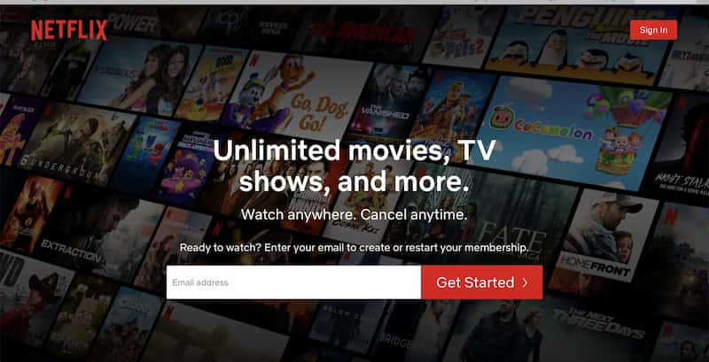
Here’s an example of a great sales landing page that we are all familiar with:
5 Steps to a good landing page
1. Have a strong CTA
Just like Airbnb has a solid CTA that attracts attention, your site should too. A strong CTA will:
- Support your goal
- Clearly deliver its message
- Encourage visitors to engage with your site
Buttons that say “Buy Now,” “Add To Cart,” or are bright red and stand out are all examples of CTA. These buttons should be placed strategically on the page and easy to access on a desktop or phone. You can even make these creative and throw your own twist on them. As long as they are to the point and don’t confuse visitors.
2. Design and user experience
When it comes to designing your landing page, remember that less is more. This is your first impression. You want it to be visually appealing, easy to understand, and navigate on a desktop and mobile device. Don’t include any information not relevant to your page’s goal and put yourself in the shoes of a visitor who hasn’t visited your site before.
Here’s some things to remember when designing your page:
- Readable text: Use large text clearly visible to your visitors and doesn’t blend into the background.
- Fonts: Use similar and familiar fonts. This will make it easier for your visitor to read and not get confused.
- Convey the value of your offer: Be concise in your offer and make it sweet and simple. Make sure your reader can read it in 3-5 seconds (the blink of an eye), or you risk losing that conversion. It only takes a blink for someone to decide whether they want to stay on your page or not.
- Images: Everyone loves pictures. Include relevant pictures that draw your visitors in and captivate them by your page
3. Remove site navigation
This seems like a small step in building your perfect landing page, but it is a monumental one, and is often overlooked. You want to keep your visitors on your page for as long you can. By removing the site navigation, you do just this. You allow the visitor to focus all their attention on the content in front of them rather than becoming distracted by other elements on your site.
4. Only ask for what you need
If you’re wondering how much information you should ask for on your forms, the answer is not too much and not too little. Try and aim for the perfect balance. The longer the form, the more tedious a visitor might find it, resulting in them just closing out your site or avoiding it altogether. Though you can obtain better quality leads with a longer form, fewer fields bring a higher conversion rate. More fields mean more work for visitors and less conversion.
5. Add social sharing icons
Social media is an excellent tool for getting the word out there about your site. Though you don’t want site navigation, as mentioned before, you do want social sharing icons. This allows your visitors to share your landing page with others. You don’t want them to stray too far, so make sure that it opens in a new tab when they click on the icons. You’re not redirecting them, but you’re allowing them to clearly promote your page.
Final thoughts
Now that you know what a landing page is, how it works, and the types of pages, you are ready to create your own. They may feel overwhelming to start, but you will be on your way to securing a hoard of leads with these tips. Take your pick from the type of page you’d like and play around with the design and CTA. Before you know it, you’ll have a successful landing page and even better conversion rates.
Landing page FAQs
What is a landing page?
A landing page is a page on your site that is made to convert visitors into leads. It is a standalone page created for marketing and advertising campaigns, has a simple focus or goal, and doesn’t include other examples. It’s a campaign-specific page with one call to action.
What are the different types of landing pages?
The three main types of landing pages are splash pages, squeeze pages, and sales pages. A marketing campaign could use one or multiple types of landing pages, depending on the CTA.
What are the components of a good landing page?
A good landing page should have the following characteristics. Have a strong CTA. Good design and user experience. No site navigation. Only ask for what you need. Social sharing icons.


